User experience best practices
Last updated: October 28, 2024
This topic describes user experience best practices for mobile and browser-based applications.
Describe the scanning process
-
iProov strongly recommends displaying information that describes the scanning process, which starts on the next screen on the user's device. This is key for better conversion.
-
Help your users to avoid the most common reasons that could cause them to fail during the scanning process. Users are more likely to pass in their first attempt, which improves the overall user experience, business outcomes, and success rates. For example:
-
Users need to know that the process can fail for a number of reasons. Providing clear guidance on how to succeed reduces the number of attempts required to complete the process successfully. This advice is different in content and presentation depending on the use case and which platforms you are deploying to.
-
For example, unlike the native iOS and Android SDKs, the Web SDK cannot control the screen brightness. Therefore, the following advice is appropriate for the web:
Increase the screen brightness and make sure that your environment is not too dark or too bright and stay still during the process.
In a native iOS or Android app, you can omit the reference to the screen brightness:
Make sure that your environment is not too dark or too bright and stay still during the process.
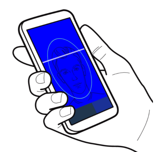
In the next screen, place your face in the oval and look at the screen. Some colors will flash on the screen to ensure that you are a real and live person in front of the camera. The process will only take a few seconds.
This message makes users aware of what will happen next while reassuring them that the process is simple and quick. When the scanning screen is shown, the users will be ready to go ahead and perform the iProov transaction.
Visual guidance
iProov strongly recommends making use of imagery and animations where possible to present information to your users in a way that is visually appealing and consistent with the rest of your application. The image below shows a frame of the animation used in the iProov demo app. This visually describes the process to users before starting the scan. This image is included in our collection of animations, you can use the image or take inspiration from it.
Keep users informed
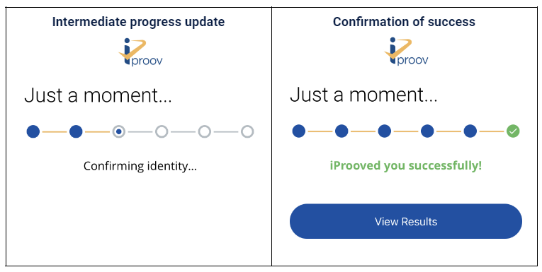
While iProov is processing a transaction, our SDKs provides your app with detailed progress information, including numeric progress along with a textual description. iProov recommends using the information to keep users informed about how far they have progressed. On slow connections the video can take considerably longer to stream. For optimal user experience, we recommend that you use an animated graphical control element (such as a progress bar) rather than an indeterminate element (such as a spinner).
Provide feedback after failures and errors
When an error occurs or a verification is not successful, the iProov SDK returns an appropriate error code or a failure reason. For unsuccessful transactions, iProov differentiates between failures and errors:
-
Failures: When a verification cannot complete successfully, for example, there is too much movement or the environment is too dark or too bright.
-
Errors: When there is a systematic error on the client or server, for example, the application does not have permissions to access the camera or network connectivity is lost.
 Important
The reason for a failure or error is included in the result that is returned to the client application by the SDK. To help users succeed at the next attempt, use these results to display guidance before they try again.
Summary
-
Let users know what the process looks like and what to avoid before the first scan.
-
Make use of iconography and animations instead of text instructions.
-
Show progress updates while the result is being processed.
-
Provide appropriate feedback to help users adjust their environment if they need to retry.
 Next step

